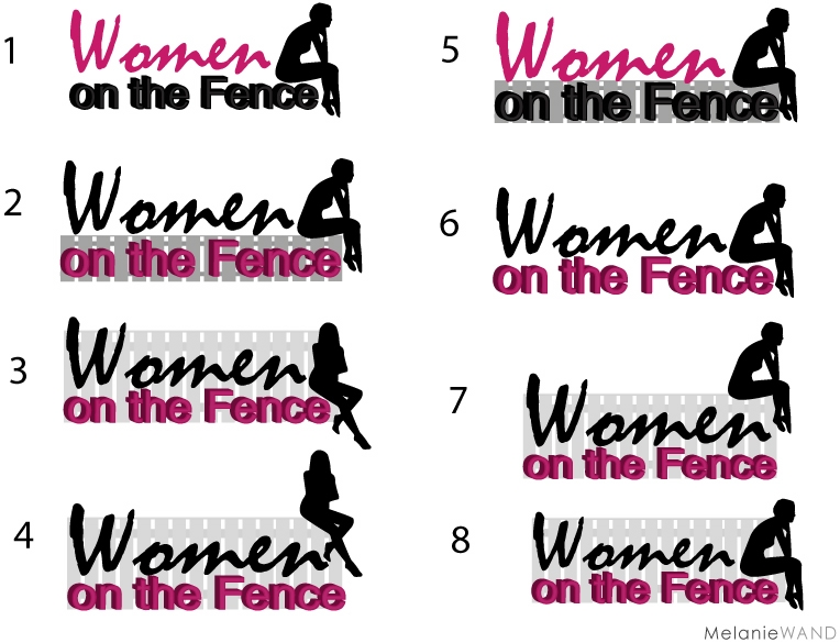
We are redoing the WOTF logo. The current one just does not fit with the site anymore, and I recognize that. You have given me your incredible input on our first run of logo options on Facebook and Twitter, and I have listened to all your suggestions.
Below are our final picks. And as I do with every blog post, I ask you, my loyal readers for your opinions and suggestions. You know our readers… they are modern women, smart and savvy moms, often on the fence in different areas of womanhood. Our readers are bright, dynamic, thinkers, doers, and reflective. There are two women represented here– the thinker making life decisions about getting off the fence, and the more confident woman (someone who has already gotten off then fence).
We feel these represent the brand, while staying true to the original vision. Would you kindly put a number below that represents your favorite choice. We are deciding fence or no fence. High fence or low fence. Which color scheme. Which woman. Sitting on top of the fence or on the letters. Please feel free to mark your choice with your favorite color scheme as well. You can click on the image to enlarge the view.
I’m veering towards 1 or 8. I need your help. This logo is representative of you the reader.
Thank you ladies! As always, I greatly appreciate all your support. I love this community.
xoxEDxox


#7
#1
#4, for my taste, in the others, the boops hang out a little bit too much.
#4 is the way to ! I Like it because women usually end up at the bottom of the pile and this shows a women higher up the fence! Pyscologically uplifting!
#3 <~Really like that one.
My vote is for #4. Have a wonderful day 🙂
I like #4. It’s assertive not passive like #8.
And the location of the silhouette grabs my eye better than #3.
#4 – i like her body language and that she is physically on the fence. because she looks confident, it says to me that she is BALANCED, meaning that instead of assuming that being ‘on the fence’ is a bad thing, she has concurred it and CHOOSES to be there
#4
that is suppose to be ‘conquered’ – lol. do you concur?
#4
#4
#7!!
#4
I like option #4.
#4
Like her strong body language. Further to Miriam’s comment about the woman’s breasts – think the female form is beautiful, but don’t think the naked form adds anything to the logo. The silhouette in #4 doesn’t seem naked. The position of the silhouette [1,2,5,6,7,8] could be seen as a little submissive or even sad.
#4
Hmmm. Is it just me, or does the ‘naked silhouette’ thing seem a bit too… naked looking?
#3 & 4 seem almost too sexy to me, while my first reaction to the other pose is that the woman looks depressed (hunched over, head in hands).
What I like about the original logo is the casualness of the way the legs drape over the fence; it’s exactly how most women are: perched on the fence in a not-too-perfect way…
Either way, I think it’s important to keep the image of the fence in some way.
Logo updates are always fun!
I think #3 or #8. The fence is important to keep. And the line of the logo works better when the woman is within the rectangle.
I prefer the strength of the #3 figure, and the fact she doesn’t seem so naked. But the pensiveness of #8 may go better with the “on the fence” idea.
Hi Erica,
I think I like #8 – the more reflective character, compared to 3 & 4 where she might be construed as defensive (as well as confident) given her crossed arms. Having said that, I’m sure I would grow to like any that you go with!
Sheri
#3 FTW!
I think #8 works best – it’s well balanced yet still gives a sense of a woman in the midst of indecision. Perfect for your brand! And while the woman is not literally on the fence, she’s literally on the WORD fence, which I think helps it work and makes an overall impression that’s more pleasing to the eye.
I know you’re fairly far along here in your logo design efforts, but I thought I’d share an article I wrote recently for newbie logo designers… not that you’re planning to DIY, it just gives you insight into the design process and could help you make your decision:
http://www.orphicpixel.com/26-logo-design-tips-for-newbie-logo-designers/
Best,
Pat
I think #4 as the women is facing forward and not bent over reflecting as in most of the other logos.
I’m for #2 or #8. I love the take on Rodin’s Thinker, and I think the fence image rounds it out nicely. I like the old one, too, but like Madonna, I believe it good to change one’s look often.
#3, sitting on the letters, or #4 sititing on the fence. Not the “thinker”
why do people think she looks naked, BTW. Silhouette would be the same with clothes on.
I think they’re all good choices. You know best.
This new silhouette is an improvement from the original one, who was looking down and a little sad and very hunched over if you remember. We will play with her figure and then decide which is best. Please keep that feedback coming!
#4 – I like her on the fence and the other lady seems sad / depressed to me…
Choosing a logo is such a hard choice (I’m in the process of a logo re-branding for a work project). Especially harder when you have such a large group of stakeholders.
That being said, my favorite is #4. The front forward female reasonates with me (and what I think your site mission is…) the side facing female feels depressed and sad. It reminds me of an image I’ve seen befoer on a good samaritan billboard! Good luck!
Hi Erica!
I like #4 the best because the fence is there but it is subtle so the confident women is more of the focus. Overall it sends the message of a woman in transition – but more of the positive side like she has already made the decision and take action to make her life better. We love your site and wish you continued success!
My two cents – you definitely need a fence in the logo AND she should be sitting on it (or else she’s not “on” the fence) – so my choices are either #2 or #4.
#4
Hi Erica,
I love #3. Very you!
I like # 4 it’s a bit more playful, a bit more out of the box than the others and yes I also think she should be sitting on the fence.
blessings
Marita
I like logo #1. It’s clean & crisp.
Erica,
I love #3 for WOF, looks powerful and fun.
and for Erica Diamond Inspiring Success, I would choose 1 or 4, haha I couldn’t choose just one.
XOXO
Thank, try our website http://www.logogenie.net to design cheap and profesionnal logo !
I really am impressed with this post. You talk about some great information. I’ll definitely be back when your site is updated…Thank You