Rapunzel here! After yesterday’s “YIKES” post, I have since let down my hair. I had a girl’s night last night, and the conversation, coupled with a few drinks, a guy sitting next to us with a “murse” (man purse), and gut-busting laughter did me good. After all, it isn’t how far you fall, it’s how quickly you get back up. I can thank my mother for teaching me about resilience.
So today, I’d really love your help. You ladies were the ones who chose the WomenOnTheFence new logo and it will be you who will choose the top banner picture for my new site, www.Erica-Diamond.com. These photos below are from a shoot, and we narrowed them down to 4 for the new site.
Blogging as you know, is not the only thing I do. As an Entrepreneur and Success Coach, I have a Business Startup Book for women, I am a Keynote Speaker, I have a Coaching Business, I am a Brand Ambassador, and so I thought I would give my business side, its own website. Simple, clean. I therefore need a picture for the top banner and I would love your thoughts. The tagline to the new site is “Erica Diamond Inspiring Success.” If you could kindly write your choice below 1,2,3, or 4, I really appreciate your advice. What picture best depicts Erica Diamond, Success Coach?
Your input means the world to me. You are my audience, you matter to me. Please let me know your thoughts and/or number.
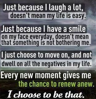
Wanted to also quickly share something I came across on Pinterest from my girlfriend Samantha Ettus. I kinda LOVE it.
Happy Hump Day girls.
xoxEDxox
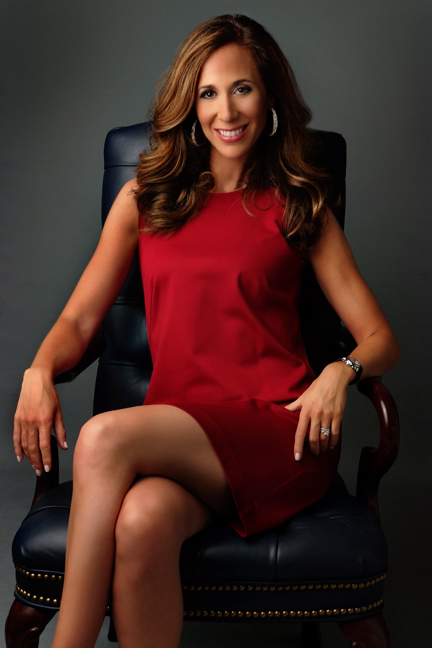
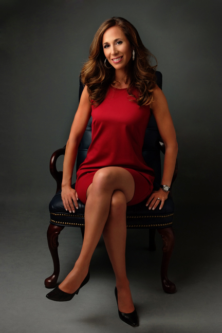
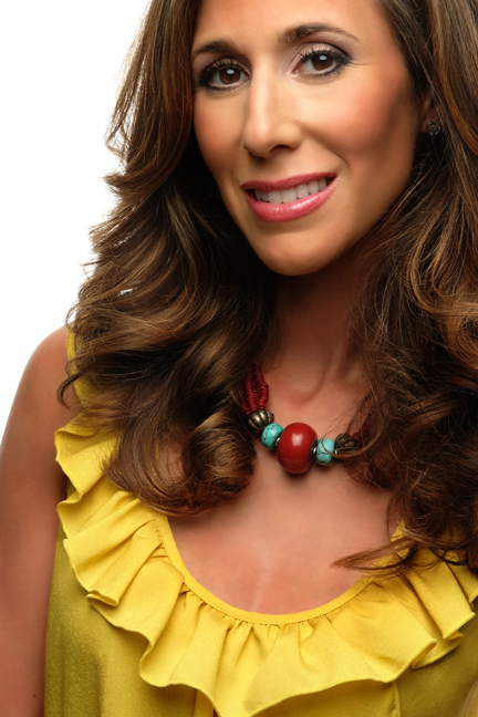
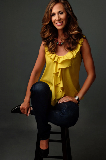

Depends what message you want to get across – what you want the photo to say about you. They’re all lovely – here’s my reaction:
1. Most corporate – with a touch of sexy.
2. Corporate meets little girl – submission, not power. Like a little girl sitting on her daddy’s office chair.
3. Coquette and casual. Smile seems a little forced, though – transmitting some discomfort here.
4. Fun, casual and approachable.
Best of luck with the new site!
Michelle, love your advice!! I am not a stuffy businesswoman, and therefore didn’t want my picture to be in a typical black blazer crossing my arms. That isn’t me. Thank you for taking the time. I really appreciate it.
I LOVE #4.
As Michelle said though – it depends on the message you’re looking for.
I agree with Michelle’s interpretations of the pictures above. 🙂
#1 hands down! Says power and strength. You look great in all of them.
1 for sure but I love #4 for your about page or another page.
#4. Love it!
#1
#4 is great too. More casual…but approachable!
🙂
1 for sure.
1 or 4 but you look beautiful in all.
My favorites are 1 and 4. Love the outfits-bright and bold
I think 4 is the best! Casual, approachable. You look the most relaxed in that one.
Hi Erica! I would say #1 for sure. You are projecting so much positive energy in this photo that I can feel it! You look so confident and so relaxed at the same time. You are already #1 in my eyes, go for #1 girl!!!
#1 exudes confidence. Though #4 is great, the focus is on the yellow top, not your expression … and you’ll have problems with this one for various documents because your head is cut at the top. Always best to do your own cropping 🙂
#1 and #4 … #1 is classy, elegant and exudes professionalism and knowledge. #4 makes you warm, approachable and charming…. I personally LOVE #4!
Photo #1. You look very confident.
My favorites are 1 and 4. You look very confident. 2 and 3 seem somewhat posed. I love the color choices.
Definitely #4. Fits with what you do. Very casual and approachable.
1 and 4 are my favourite.
I like #1 for the purpose you are looking at using it for- Red in a power color, and your composure shows confidence. You looked relaxed and your smile genuine.
(But I must say that you look striking in the yellow of #4!)
#1 exudes confidence but friendliness. Its the best.
#1 it is!
Good luck and thank you for all the encouragement.
1 or 4. Good luck!!!!!!!
Number 1! You look confident and secure. Yet not snobby or stuffy. Oh, and I want your hair!! The rest of the pictures are great as well but number 1 fits the best. 🙂
Just thanks for This post..Great work!
First time I have seen your blog and what a great post that was!
I make plan to purchase Diamond Pendants for sister and lots of Shopping with Friends.
As some of the others have commented, it really depends on what “message” you are trying to convey. Of the four it definitely comes down to 1 or 4 (which seems to be the general consensus). If you want to portray a more “business-like” persona, I would go with #1…but #4 is definitely more casual & approachable, while it still giving a “successful/confident” feel…just not as “business” or “outwardly successful” looking. (Perosnally, I like #4). 🙂
Number 1 is the winner……confident,..successful,…beautiful,…professional,..open,..comfortable in your own skin
I love the first and the last pics! They both speak clearly to me!
I really like the 1st pic for your new business site as depicts professionalism and work ethic, at least to me. Thanks and have a great day. e
I am wondering if you have ever looked at the book a year of mornings 3191 miles apart. this makes for a good story.
Thanks ann d
I like #1 it is the only one where it shows a smile that goes to your eyes. Not fake. Only thing I don’t like is you seem to be showing a bit too much leg, professionally speaking. Unless you have a back problem I would relax the back a little, too. I also own my own business, so I do understand professionalism. Maybe if you crop the bottom a little off #1. The other ones are good but the smile isn’t reaching your eyes. You are very pretty, relax and let that part show.
Hello there, I discovered your blog by the use of Google at the same time
as searching for a comparable matter, your web site came
up, it appears good. I have bookmarked it in my google bookmarks.
Hello there, just turned into alert to your weblog via Google, and located
that it is really informative. I’m gonna watch out for brussels. I will appreciate if you proceed this in future. Lots of other people might be benefited from your writing. Cheers!
Erica , congratulations on all your successes I enjoy your website , my honest opinion of the pictures
is as follows….2, 3, 4 do not project a sincere smile..remember when you spoke of the laughter
remember that when you smile…smile from the heart…if i had to choose one I would choose 1 for the sincerest smile ..but way to much cheese!…take it again from the waste up….I just picked up a magazine from the 100 most powerful women …no cheese if you know what I mean…
With all due respect and keep up the blog …you help a lot of people!
Definitely 1 – the most professional and confident – besides red is my favourite color. No. 2 looks too small and 3 and 4 are too casual IMHO.
I’m impressed, I must say. Seldom do I come across a blog that’s both edducative and
amusing, and let me tell you, you have hhit the nail
on thhe head. The problem is something not enough men and women are
speakingg intelligently about. I’m very happy that
I found this during my hunt for something rgarding this.